In many ways, human nature is very consistent. We always get up at the same time, have the same breakfast, and travel the same road to work or school. Using the same items over and over can also be convenient. After all, we all have our favorite stores and products. So why bother making an effort to change our ways?

When we use something, we usually don't think about how much time and effort went into making it as great as it can be. Some people try to reference their company in their logo, while others draw inspiration from historical icons. It's easy to miss the obvious right in front of our noses, but you’ll never make such a mistake again if you get to the end of this article.
Coca-Cola's polar bear secret
Many of us can thank Coca-Cola for keeping us refreshed throughout the years. Did you know that a pharmacist was responsible for its development? It didn't get going until after John S. Pemberton died and Asa Griggs Candler was put in charge. Given his confidence that people would return for more, he decided to distribute vouchers for free servings.
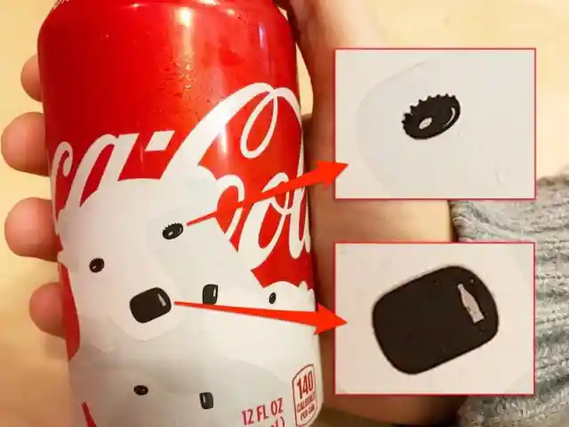

Coca-packaging, like the beverage itself, has evolved greatly over time. Their Christmas line features a polar bear, but did you realize that its eyes are really bottle caps? Additionally, the bear's nose shine is a miniature Coke bottle.
The FedEx logo
Would you believe that one of our preferred delivery companies' logos contains a secret symbol? Sure enough, FedEx invested much time and effort into designing the ideal logo. In 1971, when it first opened for business, the company shipped out only a handful of packages. Millions of customers are now regularly serviced by the company's shipping infrastructure. Originally founded as Federal Express, the company's name and emblem were simplified in 1994.
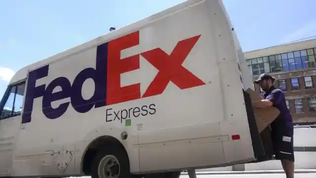

There's an arrow between the 'e' and the 'x,' but you must look closely to see it. This is meant to symbolize the accuracy and speed with which the organization dispatches orders. The 'Ex' in the FedEx logo changes colors to reflect the company's many divisions.
The meaning behind Amazon’s logo
Did you know Amazon started off as an online book vendor? After four years in business, the site now offers virtually every imaginable product. Currently, it ranks among the world's largest corporations. Since its debut in 2000, the company has utilized its present logo. The design is complex and includes many features.

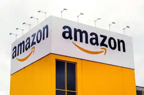
Some have speculated that the yellow curve beneath the name represents the smile of a satisfied consumer. This, according to the firm, is "the ultimate expression of customer satisfaction." The smile's final dimple serves as an additional connection between points A and Z. Basically, it means that the website sells everything imaginable, from A to Z.
The colorful NBC logo
NBC's logo, a peacock, gave rise to its "Peacock Network" nickname. It is the oldest continuously operating television network in the United States and has its origins in radio broadcasting. NBC never had a logo until it debuted on television. Most of the designs were short-lived.
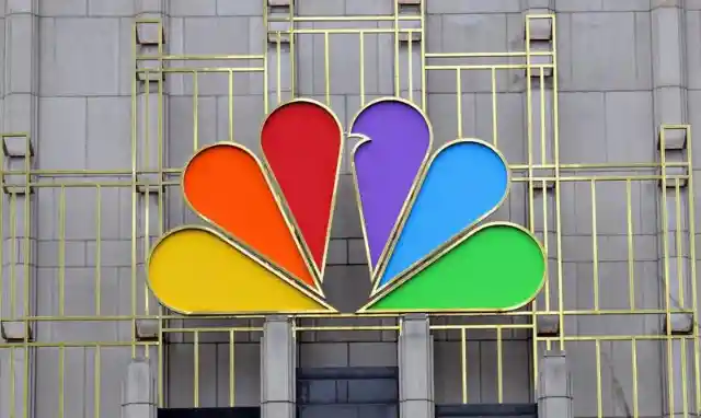

While the logo we all know and love today was finalized in 1986, the peacock itself had its initial appearance in 1956. There's a reason why NBC went with a peacock logo. RCA, a pioneer in selling color television sets, was also the network owner. What better way to celebrate color TV than with the most colorful logo possible?
The bite in Apple's logo
Many legends surround the origin of the Apple logo. Designer Rob Yanov, who became famous after inventing the logo, claims there is a logic behind the logo's final form. He reportedly began by purchasing a case of apples. Then, Rob began sketching them in various configurations, hoping to find one that would serve as a basis for a unique yet compelling final product.
Finally, he bit into one, and inspiration struck. Considering the similarity between "bite" and "byte," Rob couldn't pass up the opportunity to incorporate the bite into his design. The original logo had multiple colors to draw attention to its color displays, but it was later simplified to black and white.
The three-letter symbol on U.S. pennies
Over the years, many historical personalities, including presidents, have been immortalized on currency. That's one way to discover you've made it into the record books. Since 1908, former U.S. President Abraham Lincoln has graced the face of the one-cent coin, but who created that well-known portrait?
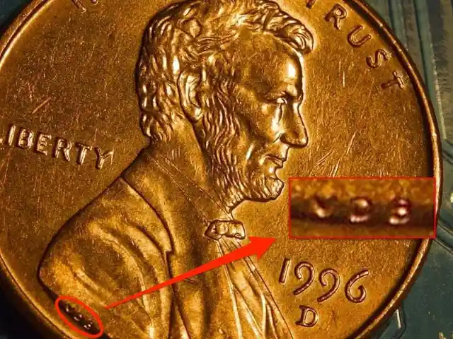

Victor David Brenner deserves all the credit. The U.S. Mint has included three unique letters on Lincoln's shoulder on every cent since 1918 – Victor's initials, VDB, as you probably guessed. Sometimes you have to take a closer look.
The laptop's power button
It’s not every day that we think about the symbolism behind the power button on our laptops. However, it turns out that the ideal symbol required extensive planning and design work.

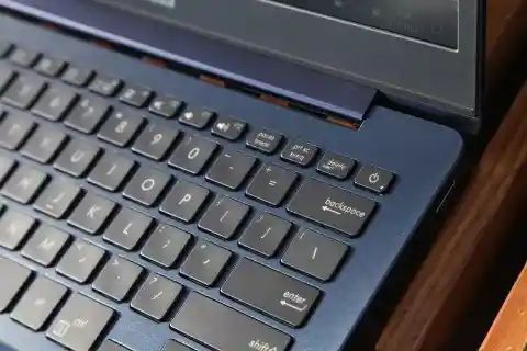
It's a circle with a line across it because of the binary system. The system has been utilized for years by engineers. The value ‘zero’ indicates inactivity, while the value ‘one’ indicates complete activity. Even when we push the power button, the device remains in a "standby power state" till we press it again.
Toyota's logo
Many people mistake the Toyota emblem for a cowboy with a stetson because of its distinctive appearance. However, as Japan isn't exactly known for its cowboys, such a marketing strategy would be out of place for a Japanese automaker. The truth is that it's a picture of a needle with some thread going through it.

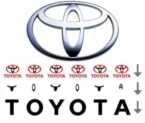
This is because the company's history includes manufacturing weaving machines. You've only scratched the surface. The letters in Toyota are spelled out in the logo as well. This logo is more complex than we initially thought. Think of Toyota's ingenuity the next time you see a car made by the brand.
The Pinterest logo
Many people enjoy using various social networking sites since each one provides a different experience for sharing content and interacting with others. Pinterest is unique in its approach. Users could "pin" concepts to their boards and compile collections of thousands of designs. Surprisingly, the site's initial reception was less than enthusiastic.

The rapid expansion of its user base can be traced back to 2011, when it first became available as a mobile app. During that time, the design went through several iterations before settling on the familiar letter P, with a design that looks like a push pin.
The Bluetooth symbol
Many of us have become accustomed to seeing the Bluetooth logo regularly. In this case, though, Vikings and technology go hand in hand. Because of Bluetooth, we can send and receive data without physically connecting two devices. Jim Kardach was reading a book on Vikings as his team worked on the technology.

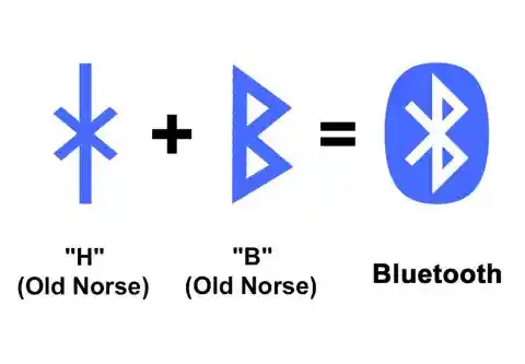
It was revealed to him that King Harald was also known as Bluetooth, though the origin of this name remains a mystery. Some say he had a thing for blueberries, while others say he had a bad tooth. Jim repurposed the word, and everyone has used it ever since. The logo consists of the letters "H" (for Harald) and "B" (for Bluetooth) from the Norse runic alphabet.
The Unilever logo is highly complex
At first look, the Unilever logo is just a capital letter U, representing the corporation. However, upon closer inspection, we see that each letter is composed of several smaller icons. There are 25 images, each representing a distinct part of the business. Unilever has stated that the icons show its commitment to integrating sustainable practices into daily life.

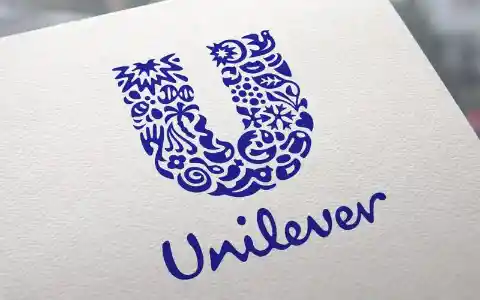
The ice cream represents treats and enjoyment. The lips represent openness and mutual understanding. The bee represents the company's dedication to improving its local community and its goal of reducing its customers' environmental impact. It's incredible how each one has a unique significance.
The Paramount stars
The cinema industry has seen its fair share of successes over the years, and Paramount Pictures is just one of many companies to contribute. The studio has a long history of success, with movies like The Godfather, Saving Private Ryan, and Forrest Gump among its output. Of course, it wasn't always like that.

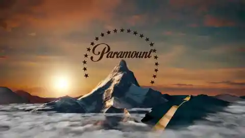
When Paramount Pictures first arrived in Hollywood, its logo had 24 stars. Each represented a different Hollywood actor or actress under contract with the studio. The organization has evolved beyond just its collaboration with well-known figures worldwide. There were only 22 stars on the emblem when it was reintroduced in the 1970s. Nobody knows what became of the other two stars.
The color of bread ties
Many of us are concerned with reducing our contribution to global food waste while obtaining the freshest food possible. If this rings a bell, you may find it interesting to learn that most of us missed the fact that our favorite stores were using a color-coded bread-tie system.

Yes, there is a method other than checking the date on the package to determine how long bread will keep. Theoretically, each day is a new color. Each weekday has its color: blue on Monday, green on Tuesday, red on Thursday, white on Friday, and yellow on Saturday. Some argue it differs between states, while others insist it's consistent everywhere.
Pepsi's logo and its multiple meanings
It's hard to fathom that Pepsi spent millions on its logo, but in today's crowded market, a memorable brand identity is more crucial than ever. During WWII, the first Pepsi globe was introduced. They intended to differentiate themselves from their primary competitor, Coca-Cola, and show they were proud of their American heritage by using the colors red, white, and blue.

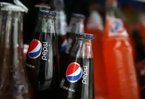
The theory of relativity, Pythagorean geodynamics, feng shui, the Earth's magnetic field, the golden ratio, the Parthenon, the expansion of the universe, and the Mona Lisa have all been suggested as symbols for the globe. A leaked report revealed as much, and these ideas were presumably pitched to increase product interest.
The down-home style of Wendy's
People often rank Wendy's highest among fast food chains. This is perhaps because Wendy's tends to adhere to tried-and-true flavors instead of experimenting with novel ones. The well-known Frosty, for example, has been a fixture since day one.

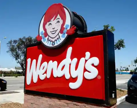
Along with French fries and hamburgers, this is just one of the many things we've come to love over the years. Look closely at the logo, and you might be able to make out the word "mom" in her collar. That's to give the impression that the chain specializes in comfort cuisine and meals that mom would make if she owned a fast food restaurant.
The bear in Toblerone's logo
Travelers at airports all across the world have made Toblerone their go-to chocolate snack. Why do so many people, when they travel, feel the need to stop and grab a bar? Try looking at the mountain the next time you eat a Toblerone bar. Swiss chocolate has been keeping a bear a secret on the packaging the whole time.

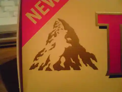
Most people dismissed it as an isolated snowbank, but the bear had a solid reason to stay in that spot. In Bern, the bear is shown prominently on the coat of arms. The candy makers believed this was the best method to pay homage to the candy's origins because it is where the chocolate originated.
The Tostito logo
When was the last time you sat back with a big bowl of chips & salsa and watched some TV? Even if there are plenty of other options, some of us can't resist reaching for the Tostitos. Though we do so casually, brands like Tostitos must consider numerous factors when designing their products and spend considerable time honing their logos.
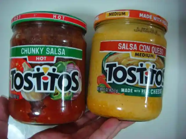
There is a reason why the middle two letters of the name are written in lowercase. There are supposed to be two of them. The yellow triangle in the center represents a chip, and the dot above the I represents a bowl of salsa.
The numbers in Baskin-Robbins' logo
When we're in the mood for something sweet, most know Baskin-Robbins is the place to go. Before they merged in 1953, Irv Robbins and Burt Baskin each had their own ice cream companies and flavors under development. When they merged, they revealed 31 tantalizing options to customers.
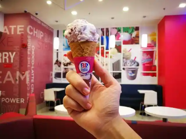
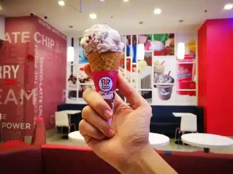
Baskin-Robbins did something that had never been done before. To celebrate their union and the expanded selection of tastes it allowed them to offer, they built something special into their new logo. The 31 is represented by the pink portions of the letters "B" and "R."
The footrest in a Jeep
The off-road capability of Jeeps is legendary. After all, Jeeps don't tend to get stranded in too many places. There are many who simply enjoy having one, while others who regularly venture off-road could never imagine driving anything else. Many of us were surprised to learn how much effort and attention went into the designs.
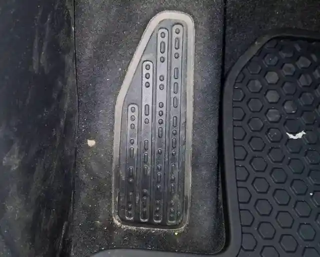
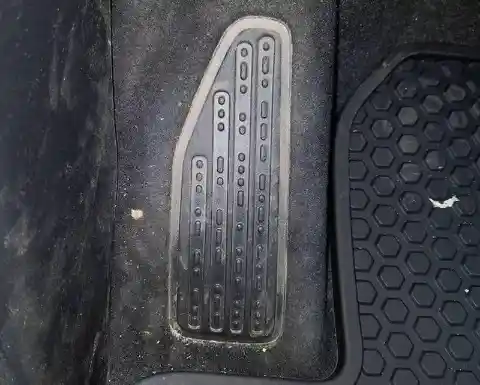
Someone spotted a pattern in their footrest that vaguely resembled morse code. Curious, they researched the morse code symbols and discovered that this footrest actually spells out "sand snow rivers rock." That's a new degree of detail!
Hidden faces in Goodwill's logo
It's incredible the variety of items shoppers have unearthed in thrift shops over the years. Some people have uncovered long-lost objects, while others have found millions of dollars worth of valuables donated in error. Speaking of which, it’s about time we hit up our local Goodwill!

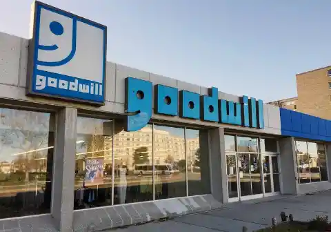
If all that treasure hunting weren't enough, we also get the satisfaction of knowing that we're making a positive impact on the lives of others. Perhaps this is the inspiration for the logo's happy face. If you look closely, you might be able to make out a tiny happy smile in the "g" of the Goodwill logo.
The character in the Beats logo
Some logos can't help but exude an air of superiority, and Beats is no exception. After founding the company, Dr. Dre sold it to Apple, dramatically extending the brand's product offerings. Many people who appreciate music would give anything for a pair of Beats headphones.
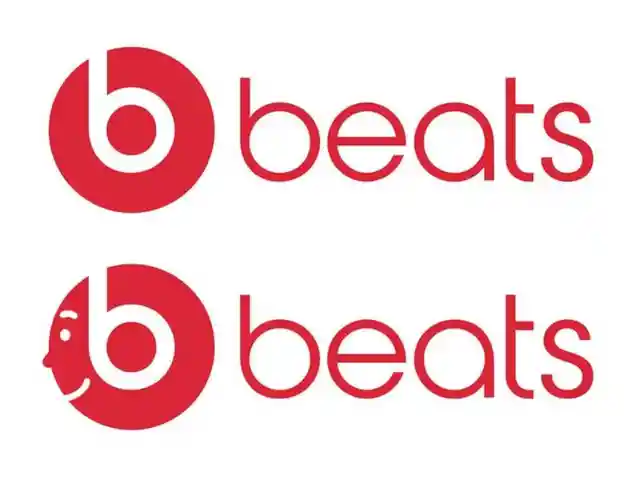
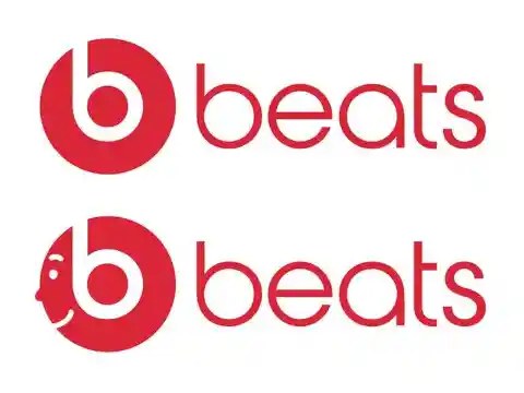
While at first glance, the logo appears to simply represent the first letter of the company name, a closer inspection reveals subtler elements. The letter itself evokes the form of headphones, suggesting that the wearer is sporting the popular accessory. It complements the products' already modern aesthetic.
Lady Liberty's spiked crown
Lady Liberty is steeped in history, having stood tall in New York Harbor since 1886. The statue was a gift from France to previous US President Grover Cleveland in honor of the nation's 100th year of independence. A total of 214 crates were needed to transport Lady Liberty across the ocean. She is currently 305 feet and 1 inch tall.
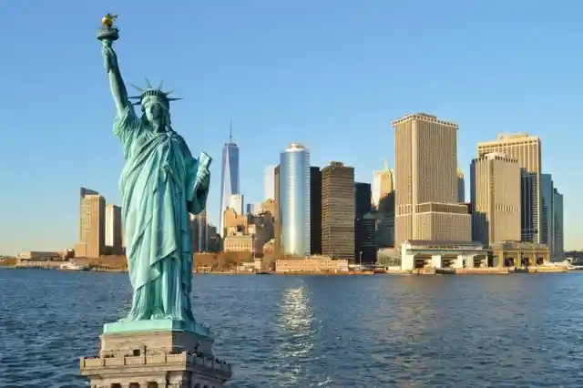
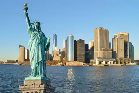
The one inch is a mystery to us as well. Around 3.5 million people visit the statue every year currently. The Statue of Liberty wears a crown, which you can see if you visit the monument. It is widely held that the seven spikes surrounding the crown stand for the world's seven continents.
The cyclist in the Tour de France logo
Each year, the world's best and fittest cyclists gather for the Tour de France. Many sportsmen spend their entire lives working toward gaining first place because of the prestige it brings. Everything about the race seems to have been well planned, right down to the logo.
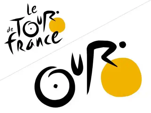

In addition to having individualized nutritional programs and training schedules, riders can take pleasure in a concealed picture within the logo of their event. It can be located in the "our" part of the "tour." The "o" represents the bicycle's back wheel, the "u" the saddle, and the "r" the rider giving it their best.
An unexpected element in Coca-Cola
The Coca-Cola logo has drawn a lot of attention over the years, with people searching for hidden meaning. When some observers noticed a subtle change to the logo, they assumed they had deciphered a secret message. The white cross in the 'o' of 'Cola' has long been misunderstood to represent the Denmark flag.
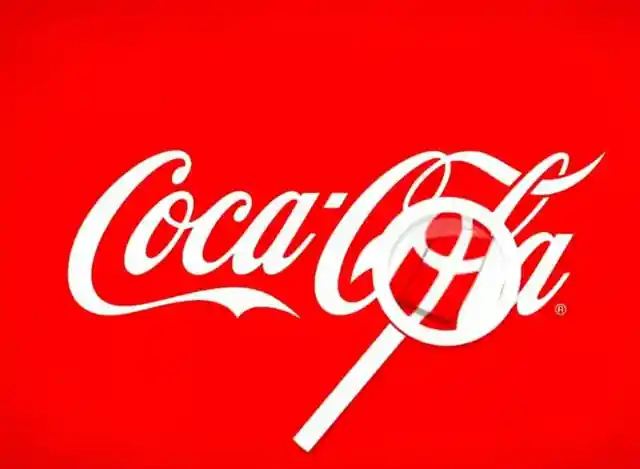

The corporation admitted that they had not planned for this to be part of the final product. Once they realized the value of this new feature, however, they quickly put it to good use. Coca-Cola decided to do a publicity stunt at the busiest airport in the country, recognized as the happiest on Earth, by greeting arriving passengers with flags.
The USB symbol
We live in a world where technology permeates every aspect of our daily lives. Whether it's your profession or you spend your free time with electronics, you've probably seen a USB symbol at some point. USB symbols are everywhere, from phone chargers to PCs. If you had to guess, we bet you wouldn't think Neptune's trident was the source of inspiration for the sign.

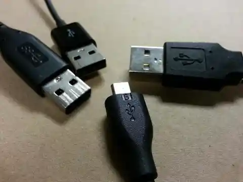
Many people expect their USB to give them power, which the trident symbolically depicts. However, this isn’t where the symbolism ends. Each point of the trident features a shape, and each shape has its own meaning. The square symbolizes ground voltage, the circle 5V (USB voltage), and the arrow represents serial data or bits.
The Hyundai logo
Although Hyundai isn't the most well-known automaker in the world, many of us have come to admire their vehicles. The brand has been around since 1967, and compared to other automakers, it consistently receives high marks for quality. In 2005, the automaker began selling its offerings in the United States, attracting a new wave of buyers.
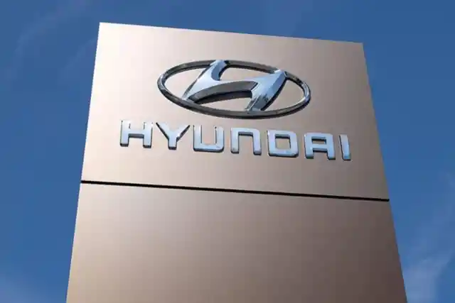

Many clients mistakenly believe that the first letter of the company name is represented in the logo. In a way, this is, of course, correct. However, it’s also meant to represent a handshake between two people. In this case, a company rep is securing a deal with a client, and the latter is symbolically shaking his hand. Can you see this stylized handshake?
The mysterious symbol found on cosmetics
Many of us spend hours in beauty supply stores. With so many options available, it can be difficult to choose which products we want. Thankfully, there's a sign to watch out for on your travels, and it's essential if you want to save money. Each one will have a symbol that reveals its safe "PAO" (Period After Opening).

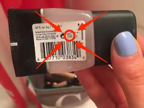
It's a tiny pot with an open lid that contains an "m" and a number. This number represents the number of months the product can be safely used after opening. The European Commission implemented this measure in 2005 to ensure the integrity of cosmetics with a shelf life of 30 months or longer.
Kisses from Hershey
Hershey's Kisses are a popular candy, and we all love them. Those chocolate drops are too tempting to resist. Many of us have a favorite variety of Hershey's chocolate, and it’s our go-to, even though the company offers many other options. Hershey's also has a secret kiss or two for their most loyal consumers.
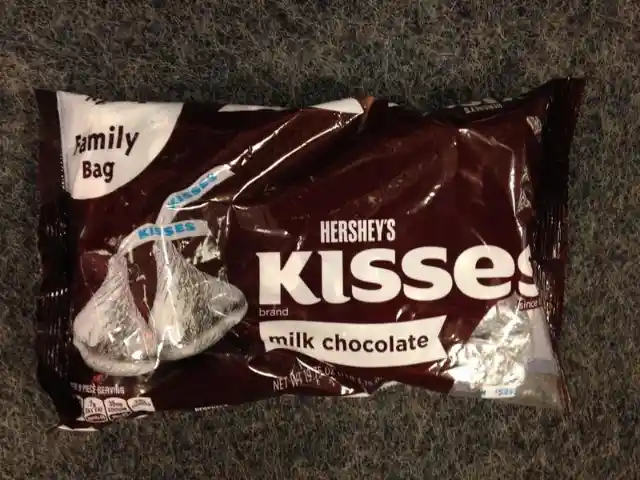
Look very attentively between the “K” and the “I,” and you might be able to make out the shape. While many people claim this is an extra kiss for chocolate lovers to enjoy, we think this one is a bit of a reach.
The reality behind the BMW logo
Since 1929, many people have fallen for the story that the blue and white checkered wheel of BMW's logo was a spinning propeller. However, this theory was debunked in 2010 by The New York Times. Just 12 years after BMWs first appeared on dealer lots, the rumor began to circulate.


Dr. Triebel is only one of many people to have studied the logo's history, and he concluded that there is another, more substantial rationale for the design. He and many others believe the colors were taken from the Free State of Bavaria flag, the country that gave rise to the BMW corporation.
Arrows on Subway's logo
Eat fresh. Those two words, along with the tagline, drew many of us to the fast food joint in the first place. Subway entered an unprecedented market. We could get some fast food on the go, but there were no burgers or chicken nuggets. That could be the stuff of nightmares for some, but it hasn't stopped others from craving subs at all hours.

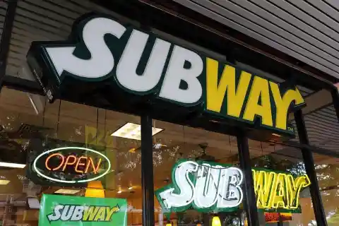
Many people think the Subway symbol is too simplistic. However, the logo's use of an arrow at either end is not accidental. That's so you can see the subway station's entrance and exit as you prepare to enjoy your sandwich.
Northwest Airlines and its odd logo
If you glance at the Northwest Airlines logo briefly, you might just think it's a circle with an off-center “N” in it. That's a component of the logo, but it's not the whole thing. This design incorporates not one, not two, but three logos into its overall concept.
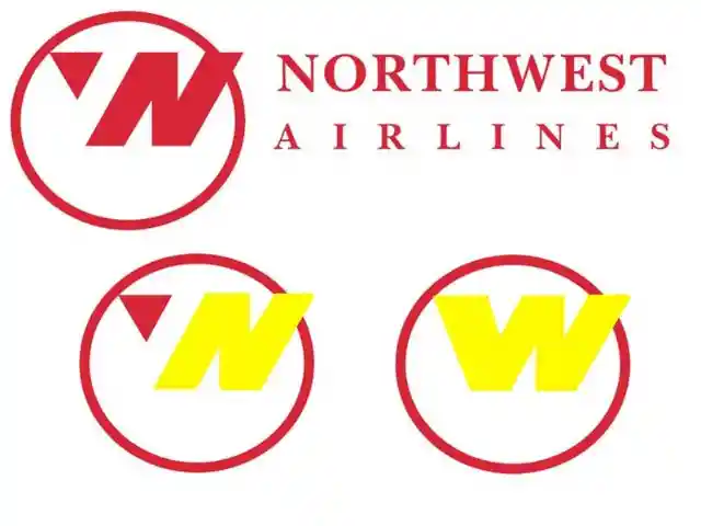
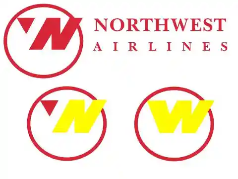
The letter “N” indicates North. When the arrow is added to the side of the letter, however, it becomes a “W” for West. Not only that, but the arrow itself points northwest on a compass. After operating independently for decades following its 1926 founding, Northwest Airlines joined Delta in 2008.
The Gillette logo’s hidden advertising
Designing a logo, one of a brand's most crucial components, might seem daunting. A logo should be instantly recognizable while showcasing your brand and providing critical context for your business. A lot of thought and effort goes into these designs, and Gillette has figured out how to make an impression with theirs.
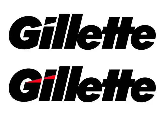
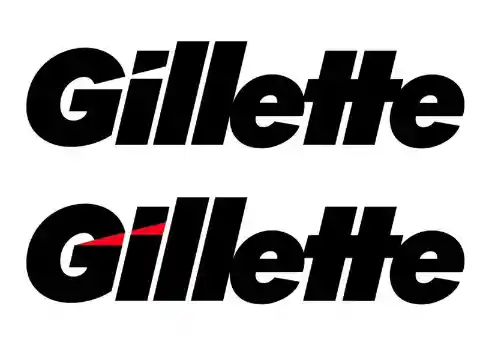
The company's razors, which it says provide a closer and cleaner shave than competing brands, are a best-seller. So they cleverly incorporated this into their logo by designing the letters "G" and “i” to look like they were cut with a razor.
The arrow by the gas gauge
Car ownership involves a wide range of responsibilities. It's not as simple as just getting in our cars and driving away whenever we like. It involves ensuring the tires are correctly inflated, the oil is fresh, and everything else is in working order. Oh, and let’s not even get started on how often we must stop for gas.
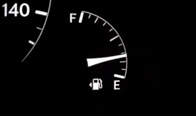
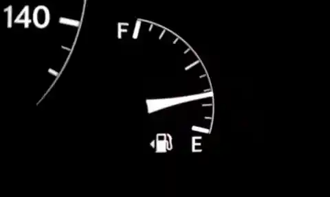
Even after multiple fill-ups, it's easy to forget which side the cap goes on. Instead of getting out of your car every time to ensure you have lined the pump up with your tank, you can just glance at the arrow on your dashboard next to your gauge. Your gas tank should be on the side indicated by the arrow.
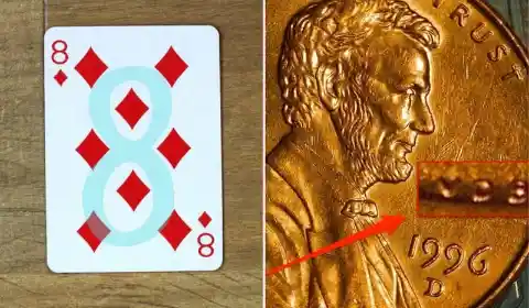
The eight of diamonds
In 2018, a social media user shocked the world by revealing that the eight of diamonds playing cards conceal a hidden meaning. Close inspection of the diamonds' rounded corners reveals the number 8. What began as a casual update to their fans quickly went viral.

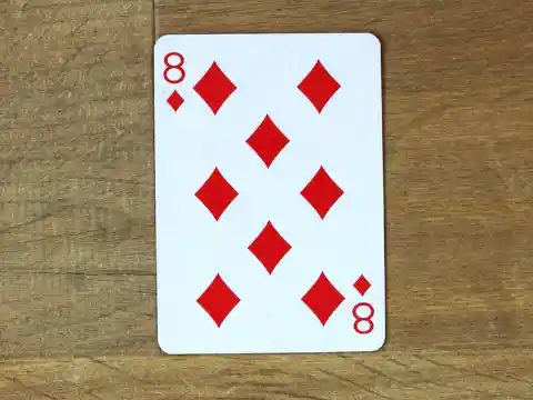
People worldwide were taken aback when they learned they'd been using these cards their whole lives without seeing the change. It didn't take long for people to check to see if the other decks had the same improvement. The eight of diamonds is the only card where the number can be seen clearly in the negative space.
The stripes on toothpaste tubes
Not everyone spends hours looking at their toothpaste tube, but it's a good idea to know what we're using. If you take the time to examine the product's packaging, you may see a colored stripe near the tube's base. They're not ornaments. They have a purpose.
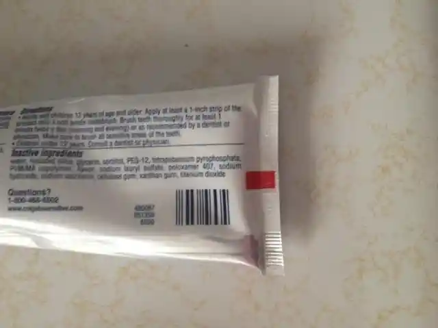
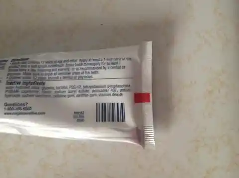
They are a shorthand for indicating the types of substances present without requiring the consumer to read the complete label. Black signifies chemical, red means chemical and natural, green means all-natural, and blue means medicinal and natural. Who would have thought there was so much to learn about toothpaste?
The logo for the Stardust casino
If you weren’t paying attention, you might have missed Las Vegas's emergence around the 19th century. Then, casinos were springing up all along the strip, some of which have since become cultural icons. Even though the Stardust casino closed in 2006, many people still remember the excellent times they had there.

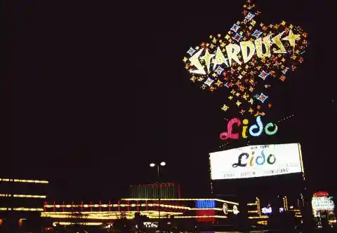
Stardust's sign was created in its specific format for a reason. Back when it was built, mushroom clouds were a common sight throughout the desert. It was the 1950s, and the Nevada Test Site was home to nuclear tests held right out in the open. How wild is that?
A secret in the Falcons logo
The falcon is an obvious inspiration for the Atlanta Falcons' logo. What else would we expect? As it turns out, however, this striking bird is only the beginning. This falcon, like the Falcons, has its eye on the prize. The bird's pose, however, has also been altered to resemble the letter “F.”

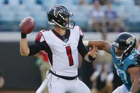
All these years, the group has continued doing what they enjoy doing best. They've been wearing red or black helmets with the logo on them from the start. You won't believe this, but in 1974 the team debuted a white helmet that they never actually wore in a game.
Sony's Vaio logo
The market is flooded with various electronic devices. When you need anything new, knowing where to start looking might be challenging. Companies have come in to fill this void by designing deceptively appealing logos to trick you into buying their products. Vaio was created as a separate company from its parent firm.
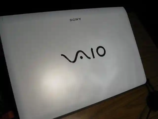

Despite the company's focus on laptops and smartphones, a lot of attention went to the logo. The logo's “Va” is meant to resemble an analog symbol. The digital signal was represented by the letters “io.” So, the two parts of the logo work together like a wave to form the word "Vaio." Isn't that a pleasant coincidence?
The mustache of the King of Hearts
When you reach for a deck of cards, focus on the king of hearts for a moment. Maybe it won't escape your attention that he's the only one without a mustache. Perhaps there is a good explanation for why he is the only monarch without a beard. In the past, wooden blocks were used to produce playing cards. People had to take extra care in delicately carving out the designs before they could be printed onto the cards.

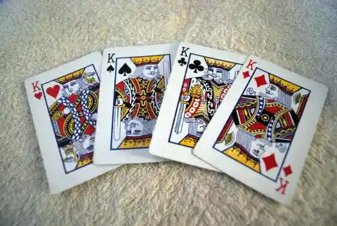
Apparently, unskilled workers ruined the portrait, causing the king to lose his mustache. The king of hearts was modeled on Charles the Great, who we are told carried an ax. This was eventually changed into a sword that he appears to be driving into his own head. How morbid!
The color of barber poles
Those poles you see in barbershops date back to the Middle Ages. They weren't always the establishments that most of us know and love today, though. They doubled as barber surgeons. The Catholic Church forbade clergy from doing numerous medical operations, and other doctors refused to perform them because they were considered beneath their expertise. People sought out barbers instead because they were skilled with blades.


That meant you might get your haircut and shave while also getting your teeth pulled or broken bones set! That’s why the poles feature red for blood, white for bandages, and blue for deoxygenated blood. The colors were brought in to attract customers who couldn't read.